Leading Life Quote Case Study
Asked to take a quick look of the website to do a design analysis.
Homepage
1
2
3
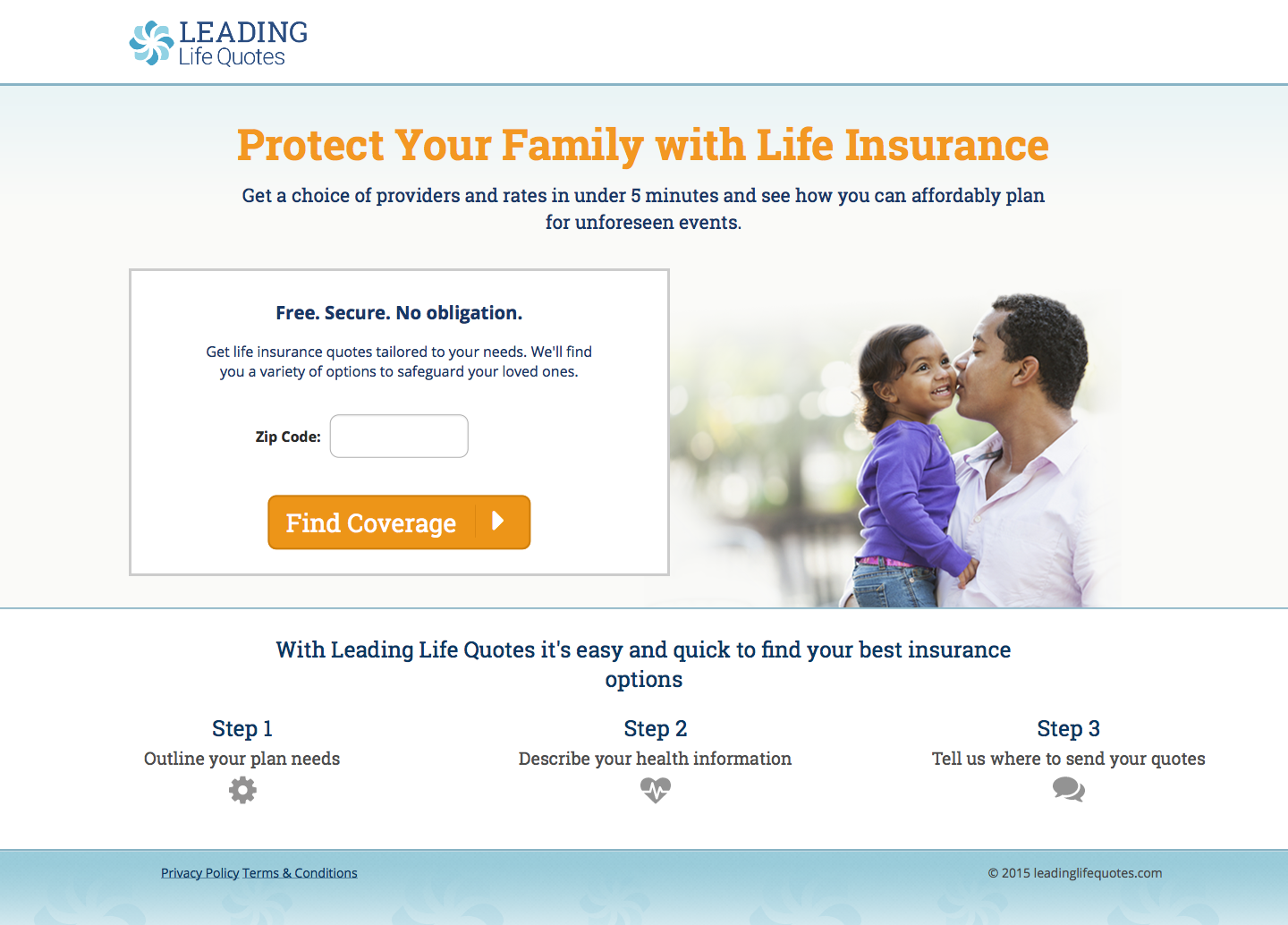
-
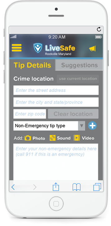
The text "Get a choice of providers and rates in under 5 minutes and see how you can affordably plan for unforeseen events." The "5 minutes" is misleading because everyone have various speed for finishing a task.
-
The photo is not inclusive for the general family member in United States.
-
Asking for a zip code could potentially deter some users from continuing to the next screen, because he/she want to be anonymous.
Recommendations:
1
2
3
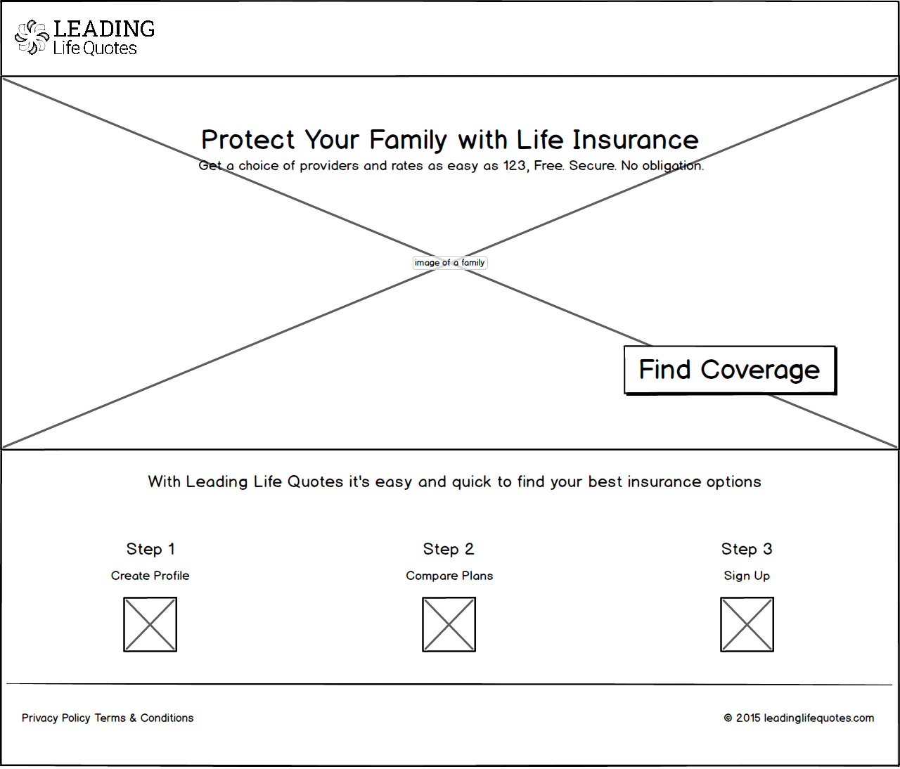
-
Change the text to "Get a choice of providers and rates as easy as 123, Free. Secure. No obligation," which implies the tasks will be a piece of cake.
-
Find an inclusive photo that represents the various family member in United States.
-
Take out the Zip Code box which allows to have space for a large family photo, creating welcome feeling to the website
My Design Process:
Identify the problem:
I interview the client and ask a lot of questions such as:
- Who is the main target audience?
- When is the deadline?
- What message you are trying to convey?
- Is this project part of a larger campaign?
- Where is the end product going to be used?
- What is your competition doing successfully?
- Do you have certain constraints that we need to adhere to?
Identify the target audience:
On this stage, the client and I will create persona(s), a make believe person or people. Each persona(s) will have a name, personality, age, what influences their decision making, and a general story about them, specially if it helps the project.
Brainstorm session:
Once the client and I have the persona(s) identified, then, the client and I examine each persona(s)'s preferred method of communication, color, form and shapes, technology that he/she is already using, and identify what they have in common, also known as the sweet spot.
Solidify the tone:
Once the sweet spot is identified, I will create a mood board according to the sweet spot to show the client for approval. This mood board identifies specific colors, shapes, and fonts that the project will look and feel like.
Comps. Once the mood board is approved, I apply the basic look and feel to various mediums identified such as a website, brochure, posters etc.